Mercadona
Redesigning the shopping experience on the desktop website
| Challenge | UX and shopping experience redesign on desktop |
| My role | Research, Information Architecture, Navigation flow, Wireframing, Visual design |
| Software | Whimsical, Figma |
| Project time | 2 weeks |
Overview
Mercadona is one of the most known chains of cheap supermarkets in Spain. This company was one of the first ones in having online shopping more than 10 years ago. However, their shopping experience has not changed over the years.
Research
Problem statement
Online shopping has become one of the keys in e-commerce during the last few years. During covid, supermarkets have increased online sales and this became one of the main income.
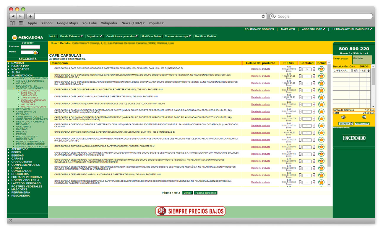
It is being more than 10 years since the creation of the website and there have been no changes since then.
Who buys in Mercadona and who is using the website?
Several consumer associations determine that the consumer in Mercadona is a person that worries about their health and wants to be informed about healthier options in their diet. This profile is also more solidary and responsible in the way they consume.
In specific, we are talking mainly about families and workers with a low-medium income.
During Covid, the number of people that have decided to go online with their grocery shop has increased; young people, families, people that live alone and couples with a low-medium income.
The reasons why they would buy only are to save time, be able to spot easily the offers, avoid heavy loads and be safe.
Findings from the research
To address the difficulties users were experiencing in the current website we asked a group of 30 subjects getting the following results:
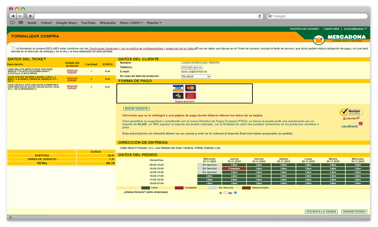
- The test subjects found that the shopping process was too long due to all the steps they needed to follow not only to log in but also during the shopping process itself.
- The new users found the shopping process long and difficult to understand.
- The change of the pages’ design during the shopping made complicated the purchasing process as they needed to relocate where the menus, buttons, etc were.
- Users found there was a lot of explanation text to understand how the system work.
- The search for products wasn’t easy as there were no images or search filters.
- Not being able to save a card requires introducing the card information in every purchase
- They found it difficult to read some of the text due to the font size.
Goals
- Guide and make the shopping process easier for the customer
- Suggest products and offers
- Provide information about the products
- To have a section where the customer can share their experience with the product
- To encourage the regular customers of the supermarket to use the website and buy online
Possible solutions to improve the experience
- Create a more intuitive, consistent and visual system
- Improve the search with filters and suggestions
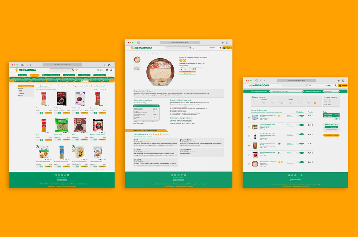
- Add products images
- Use types of diets and allergens filters
- Reduce the steps between actions
- Simplify how to edit personal and payment information in the profile and in the purchase stage
- Show more nutritional information including allergens and customers reviews on the single product page
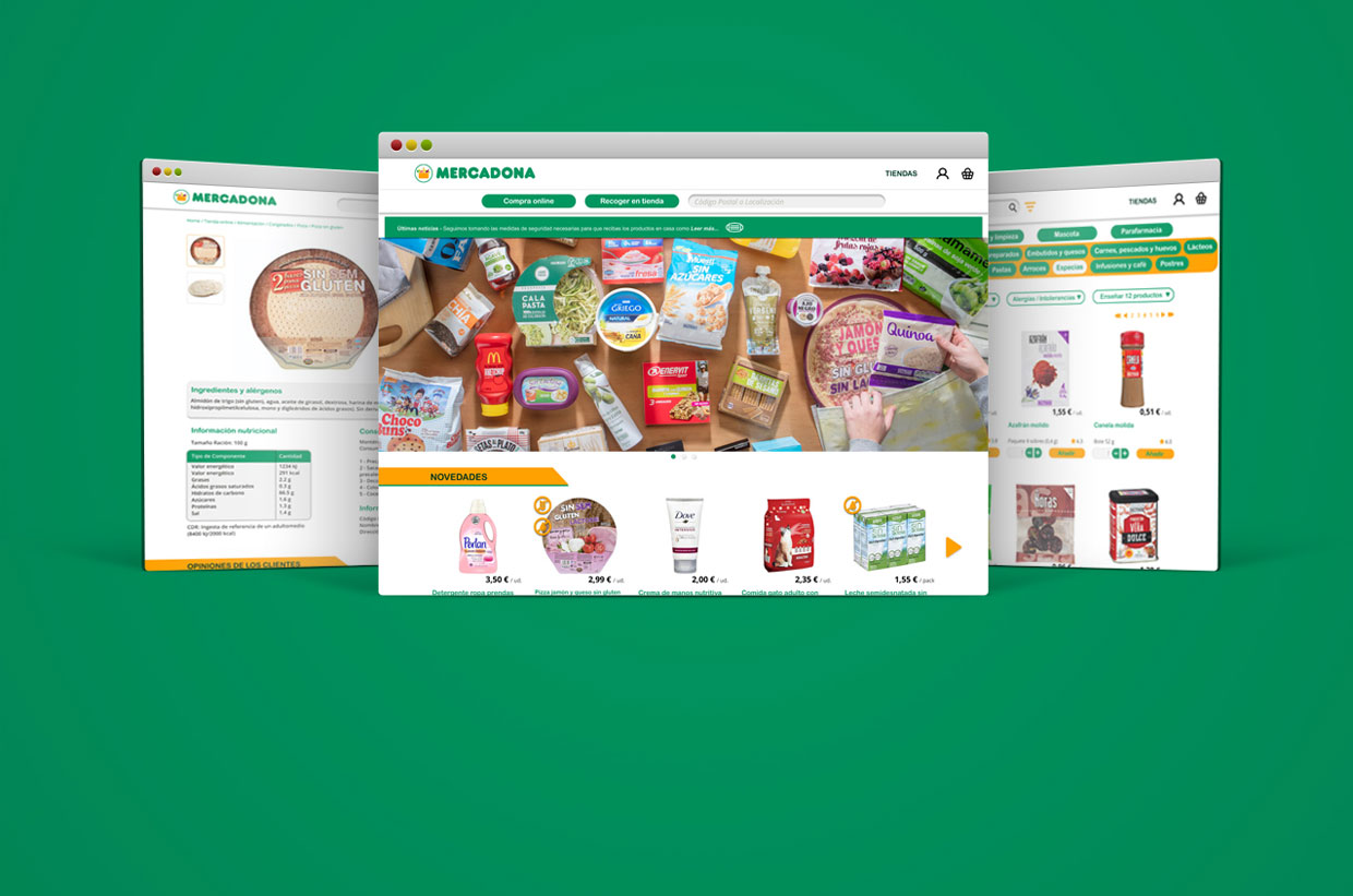
- Show promotions and specials on the Home page and the product page
- Add a notification bar with the important latest news
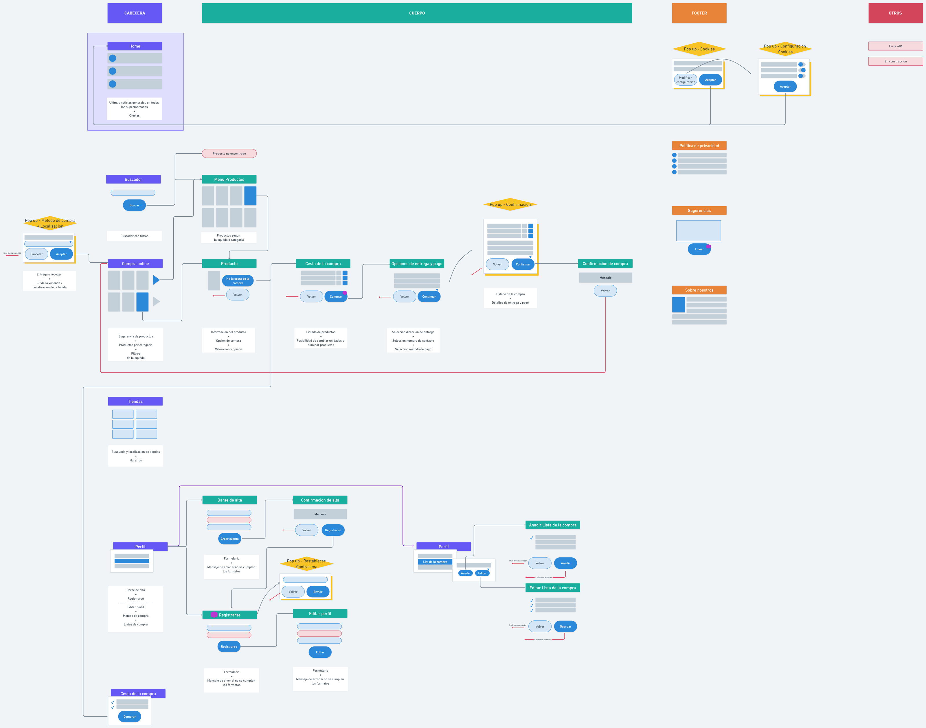
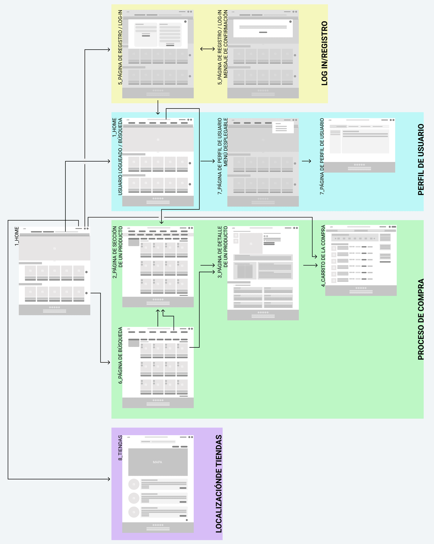
Navigation flow
Hover over to zoom in (desktop version).
Wireflow
Hover over to zoom in (desktop version).
Visual Design
